Web Design
Custom Site For Oklahoma Skydiving Center
Making It Personal
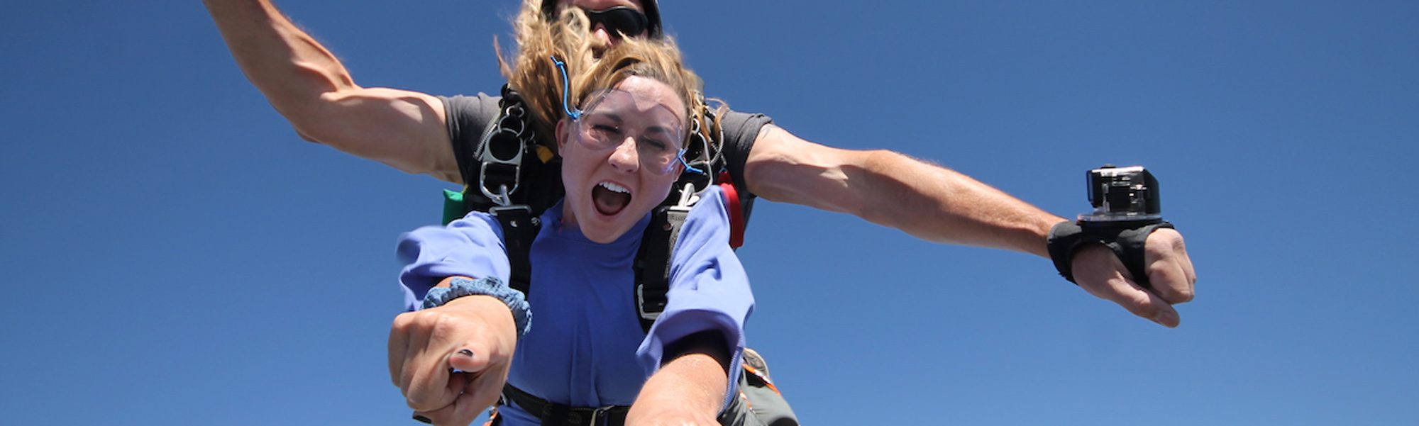
To the general public, skydiving is all the same from one DZ to another. Most people are unaware of any differences between a Cessna 182 and a Twin Otter or in the case of Oklahoma Skydiving Center, a unique 206 turbine. Because so many skydiving centers market the same way (speed, adrenaline etc), we look for ways to differentiate our clients by telling a different story.
For Oklahoma Skydiving Center the differentiation lies with its owner, Andy Beck. Andy Beck IS the Oklahoma Skydiving brand and we wanted that to come through because Andy’s approach to business feels different than other DZOs.
Andy’s approach can be defined using adjectives like caring, honesty, integrity, familial, hard-working, passionate … essentially, Andy believes in doing the right things and running a DZ the right way. Money is secondary and because of his approach, the money takes care of itself.
Storytelling
When building a website, we think about telling a story, but we have only moments to tell it. It’s why we elected to take a different approach with the call to action text in the home area. Rather than populate this valuable real estate with the showcasing of a sale, we wanted to express verbiage not usually seen – SAFETY, FAMILY, FUN.
These three words tell the story of what Andy and his team represent and we felt it was important. You’ll note the use of the word ‘family’ throughout the website. We want to connect with potential customers as people, not as adrenaline junkies hopped up on endorphins.
Also, you’ll note we spotlighted the staff on the home page, as opposed to tucking that feature under the About Us main menu. Our reasoning for this was to personify brand wherever possible.
Modifying the Brand
Aside from the web design, we developed the Oklahoma Skydiving logo to better reflect the brand that is Andy and his management style. The prior logo looked more like the emblem of a hardcore rock band from the early 90s. We wanted to soften the branding to make it congruent with the identity of the DZ, its owner and the community.
CLIENT TESTIMONIAL
“James and Melissa are an absolute pleasure to work with! I was trying to decide between a few different companies to help with my marketing efforts when I first visited with James. He immediately gave me the info to make a decision, and I haven’t looked back since! We are experiencing our best season ever, and with our new website Melissa created with her team our customers are happier than ever! If you’re looking for a high-quality company to partner with you have found them! I couldn’t be more pleased with the results we have achieved together!!”
Andy Beck – DZO, Oklahoma Skydiving Center
Learn More About: Our Services | Branding | Website Design | Digital Services
![]()