Web Design
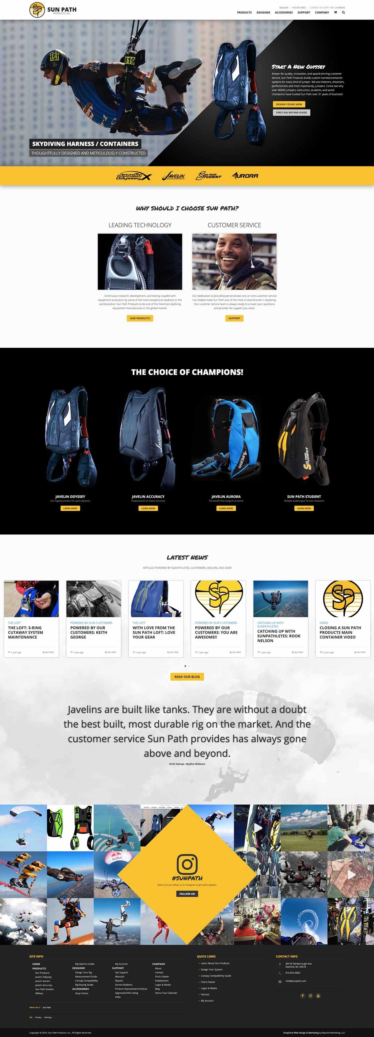
Custom Site For Sun Path Products
As one of the world leaders in parachute container manufacturing, getting the call from Sun Path was a huge honor for us. As a small agency, the Sun Path project represented a mark of credibility that we weren’t going to take for granted. Our goal was to create a beautiful website that the hard-working team at Sun Path would be proud of.
Design Requirements
The Sun Path site had three primary requirements: an informational site, a custom rig designer, and an e-commerce platform all wrapped into one.
Product Display
As we often say, a website is only as good as its photography and Sun Path had beautiful images to work with. Having beautiful photography at the beginning of a project allows our team to daydream and get more creative with design.
The informational pages for the various rigs have been designed to be more photo-centric and less text heavy with lots of clean white-space for easy readability.
Products like rigs have a lot of information and our task was to showcase product features, color options, stock options, sizing options, canopy compatibility, measuring guides and manuals without any page looking too busy particularly during the mobile experience.
Color Designer
If you look at the majority of 2-D color designers in the industry today, they’re all much the same – we were tasked with re-imagining how custom rig designs would be created. To do this, we went back to basics asking some basic questions like: If we were designing a rig, what would we want to see and know?
The result led to a clean design that allows the end user to:
- easily navigate through the 40-step ordering process
- have a running cost calculator throughout the ordering process
- allow the user to save designs for easy sharing with friends and to return to a design without the need to rebuild it
- clearly see the rig changing in real-time when variables are added
- understand what each option means for a more clear understanding
E-Commerce
The third installment of the site is the e-commerce section which allows Sun Path to easily sell accessories for their rigs. Users are easily able to navigate the store by using photo categories which permits for faster navigation on mobile.
Learn More About: Our Services | Website Design | Digital Services


