Web Design
New Wordpress Website
Not Your Average Dropzone
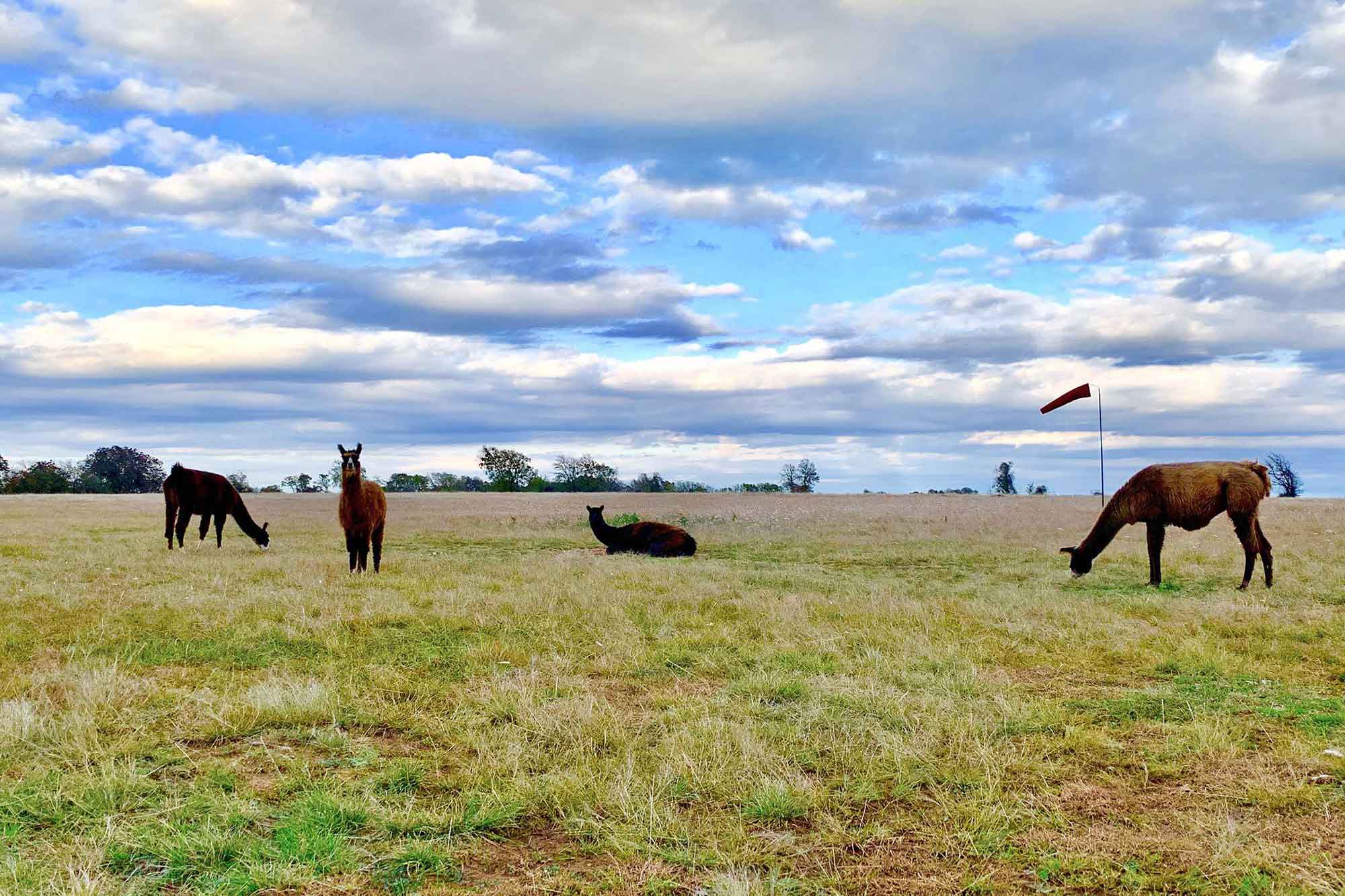
DZO David Moore has a special relationship with the 100 acres of beautiful Texas countryside on which his one-of-a-kind dropzone is located. He did his first tandem at the DZ in 2008, five years later moved onto the premises, and in 2016 bought the farm. It’s literally a farm … complete with friendly donkeys and llamas who roam free-range throughout the DZ. In fairly close proximity to several other Texas dropzones and yet totally different from every one of them, Texas Skydiving is a hidden gem, and – as he should be – David is proud of it.
Initially, David engaged DropZone Marketing only to redesign the TXS logo but, after a great experience working together in 2020, he returned to us in 2021 to also build a new website.
First, The Logo
David’s existing logo wasn’t doing it for him. The type and skydiver both felt a bit generic, and the skydiver couldn’t convey the brand on its own; it had to be represented alongside the text. David wanted a brand mark that was:
- Authentic
- Original
- Visually Interesting
- Memorable
- Versatile
- Modern
Old Branding

New Branding

And Then A Fresh & Clean Website To Match
Thrilled with his new logo, David engaged Team DZM to:
- Design a website around data analysis without losing the essence of Texas Skydiving
- Take user experience and flow into careful consideration
- Optimize for Google Search Results across dozens of highly searched keywords
- Integrate with Burble software to augment UX and backend efficiency
Hearing David talk about his long term goals for Texas Skydiving and what he wanted to convey with his new website was exciting for our team. So many skydiving websites out there are designed to sell, Sell, SELL! Of course the ultimate goal of every DZ website is to increase foot traffic, but that doesn’t at all mean that the website should be only transactional in nature.
David is a passionate skydiver who considers it a privilege to advance the sport, and a mandate to do so in a supportive environment. David wanted his new site to clearly communicate the DZ culture, philosophy and values.
Ahhh … exactly the kind of project we at DropZone Marketing love sinking our teeth into …
Not Just A Good Looking Website
David’s website is a great example of DropZone Marketing’s superpower: our people.
Each of us leaned in to listen to what David wanted for the Texas Skydiving website. Then we individually and collaboratively did what we do best. We dug into the details. We researched and tinkered, played and pitched. Some ideas blew David’s hair back; others ended up on the cutting room floor. And all of them were the right decisions for the brand.
Having established a relationship built on trust, our client and creative team emerged from the sandbox with a website that is true to Texas Skydiving.
Learn More About: Our Services | Branding | Copywriting | Website Design | Digital Services

After a good bit of research, we went with James and the Beyond Marketing team last year to develop our new logo. Our choice was heavily influenced by James’ history in the skydiving industry, their insightful blog posts, and portfolio of past work. Having seen the way they operate and quality of work first-hand, it was a no-brainer to go all-in for a new website too. We couldn’t be happier with the results! This team is the real deal. They have a clear passion for customer service, a specific knowledge of our industry’s challenges, and some killer design skills. It’s been worth every penny, and a natural step toward building our version of the perfect drop zone. Thank you James and Beyond Marketing!!

